


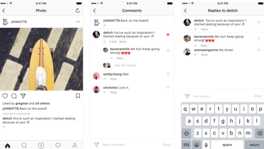
Ever wish Facebook and Instagram’s layouts were just a little more legible? While both social media platforms regularly update themselves, we think we’re past-due for a new one. Drawing inspiration from line drawings, as well as Reddit and Messenger, Facebook is completely remaking their News Feed design. It’s now much easier to tell where comment threads start and begin. Today, Instagram also did a bit of overhauling with their comments now being threaded so you don’t have to go through everyone else’s comments just to find your reply.
As you can see in the video below, navigation and like buttons are also bigger and clearer with their new, unfilled line drawing design. Instead of the traditional globe icon for notifications, it’s now just your standard bell.
By creating more white space on Facebook, you can actually experience less eye fatigue, and experience more vivid content. The design team writes, “we did not want to just ‘fiddle at the edges’, but rather make something that billions of people use every day less frustrating”. Facebook is also taking the Messenger-style bubble comments to your News Feed, making threading more obvious and encouraging rapidly-moving conversations.
So, what do you think? We love the new designs, but we have to admit, it’s not very helpful with our social media addiction!
